Paperstrips - A DIY Typeface

One October morning, after reading through some federated social media posts using the web client for Mastodon, I opened up Inkscape and began to fiddle with a typeface idea, producing a quick test of making letters to simulate folding paper strips in order to make the letters.
It took about an hour to build the four letters, and then it was time to post the idea to social media (because, why not share it?).
Encouraged by the response to the idea, I worked further on the whole alphabet, completing the 26 capital letters by the end of the next day. (Lower case letters are doubtful.)
Along the way, I learned it was important to create some standard guidelines: width of the "paper" strip, overall letter height, etc. so all the letters would be compatible with one another. Turning on the grid was the easiest way to control some of those things.
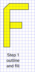
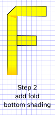
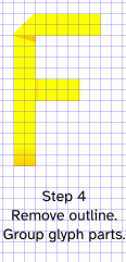
For each letter, there were a few basic steps:
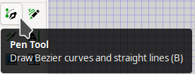
I used the Bezier pen tool to create the outlines and chose yellow (RGB Hex 255,255,0) for the fill and a linear gradient (RGB Hex 255,200,0) fading from 100% opacity to 0% opacity for the corner effects and the commonly "weighted" bottoms of each glyph (weighted for dislexic accessibility). If you want to change colors, you'll need to do a lot of work for the letters you use. I was thinking about sticky post-note paper as I began the project.
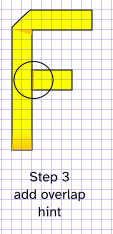
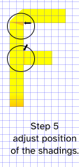
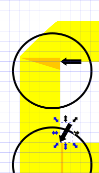
Zooming in to deal with details made fine adjustments easier. The next image shows that the small shading details are not quite right. Using the Alt key and arrows with that part selected lets you fix the positions so that they look right.
Each letter of the alphabet is also known as a glyph in typographic jargon. That's because a font typically contains more than just the letters of the alphabet. There are punctuation marks, for example. When you want a really complete font, you'll need to do glyphs for all the accented characters needed in foreign languages based on the Latin Basic alphabet. You're on your own for Cyrillic, Hebrew, Arabic, etc. This is a hobby project.
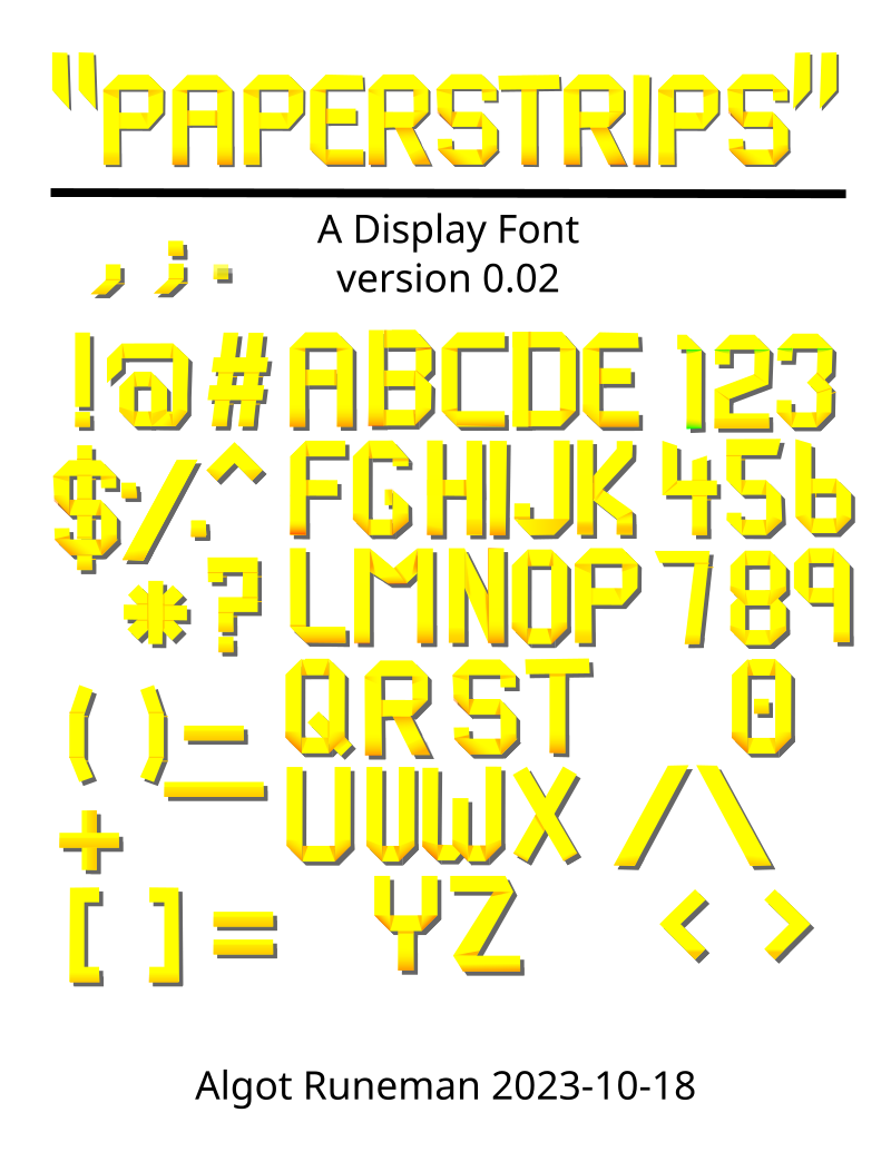
In this particular case, the purpose of the font isn't for body text. It is, rather, for headlines or signs, posters, etc. I decided to limit the font to the basic 26 capital letters, the 10 digits and many of the punctuation marks.
The current version is a pre-alpha stage. Still, it may be of interest to some in its current form.
The only way to use the glyphs is to open the SVG file in Inkscape or another SVG editor and then copy the glyphs you need for your text and paste them into a new Inkscape document, hand placing them into words as you work.
The sampler page shown next has had a drop shadow added in order to help make the glyphs stand out better from the white background of a typical web page. You may also decide the text looks better against a different background color.
The "eventual" goal is to make this into a true, downloadable/installable font like the ones we are used to using in our document pages for print use and for web pages. It's my understanding that color font with support for shading is developing in current browsers. Not being a font expert means that I need to do a lot of work to understand how to convert this font from its current form. I need to do a lot of learning!
Resources
paperstrips0.03.svg - the latest version.
Inkscape may be available in your standard distribution, but it may be behind the latest version. (Linux, Windows, Macintosh)