Intro to Inkscape 1.1
Part 3: Using the Grid Feature
Preparing Controlled Paths
Video:
You may also wish to view the September 2021 NatickFOSS Youtube recorded meeting video (23:45 minutes into the video for the Inkscape segment). Also, if you need to review the basics: Inkscape Objects
In the last meeting's presentation, we explored the basics of the creating paths with no particular shape, because you can do any shape which suits your purpose, using as many node points along the closed path to make your design. This time around, I want to introduce a more "patterned" kind of path.
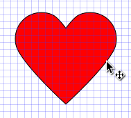
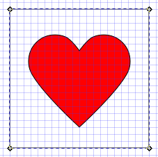
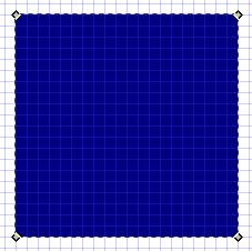
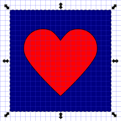
This article will try to show how to make a simple, but 'controlled' shape and work with it to create a clipart. We'll explore making a Valentine's Day image like the next image.

Inkscape has lots of settings and options which can be daunting. Take steps slowly to learn some of them and reuse the features you have already practiced as you try adding only one or two new ones for each practice session. If you try to grasp too many at once, and you're like me, you can get very confused.
Go to the view menu at the top of the Inkscape window and choose to turn on Page Grid. The white background of the Inkscape workspace should be overlaid by a rectangular grid, making it look like the graph paper you probably used in high school math classes. The grid will help us constrain the location of each node as we make a shape, in this case, a heart. We will then add other elements to jazz up the image and add some text as well.
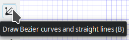
Select the bezier tool from the left hand column and click a point on the grid somewhere near the middle of the screen. It does not matter where the page outline is at this time, but if convenient, you might center on it, too.
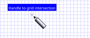
When you move the pointer to a grid junction, you'll see a helpful note saying that the node of the click using the bezier tool will get placed on that junction. Look for the little X.
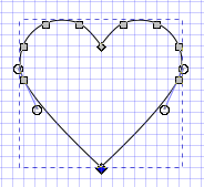
Bear with me as I go quicker than the eye can follow to create a very blocky Valentine's heart. (It was easier to see in the video than it is here.)
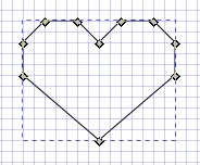
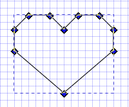
The next step is to use the mouse and left click/drag diagonally and release the mouse button to surround and select all the nodes of the blocky heart (once again, easier to follow in the video). At this stage, you could also do Ctrl+A or the Edit menu to Select All at this early stage. You want to have all the nodes "on" before turning just the middle two nodes "off" before smoothing the lobes of the heart.
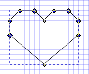
While I hold down the shift key on the keyboard, I will click only the two nodes down the middle of the heart. The steps are illustrated by the image trio below. [None selected - all selected - only right and left selected].
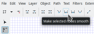
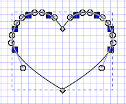
Then, while the node tool is still selected and only the left and right nodes are selected, go to the toolbar at the top. It is specific to the node tool. Choose the option to "Make selected nodes smooth". When you do that, the heart shape should suddenly look more Valentine-like.)
I recommend practicing the process a few times...really...counting the number of grid squares you use carefully to make sure the shape is balanced. It is possible to drag individual nodes around to correct a skewed, blocky heart, but it may be less frustrating to re-do the entire shape. It will be a matter of your preference in the end. You should practice long enough to develop the techniques as much into muscle memory as you can. Personally, I wound up feeling that the heart was a little to blunt, so I clicked to select just the bottom point and dragged the handle down two squares on the grid.
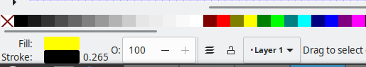
Finally for the heart itself, let's choose the "proper" red color. The color toolbar at the bottom has a nice, bright red among the set of colors just after the range of grays. While the heart is still showing handles, click the red color block from the palette.
I'm going to do this next part in a different order from the meeting's video. Hope it does not confuse you. I think the result will be the same, but this might make some ideas clearer.
Let us add the clipart background next. Of course, because creation order puts newer parts "on top", it might have been smart in "production" to do the rectangle first, but we can change the order easily, so here we go.
Make a new rectangle using the bezier tool again. It need not be perfectly centered on the heart. That can be easily fixed later. When drawing a bezier outline, there's no color assigned to the empty shape once you click back at the starting corner handle. Make the rectangle dark blue. Right away you will need to remind yourself that the newer path/object is automatically on top. You'll be lowering it in moment.
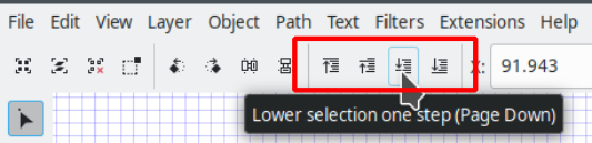
Select the primary selection tool next so you can access the order controls for the blue rectangle. Make sure that you select the blue rectangle so it has the arrow handles around the edges. It does not matter which arrow handles are showing. (Don't forget to quiz yourself about what each set of handles means and what each allows you to do. Review and practice as needed to be sure you know the difference.)
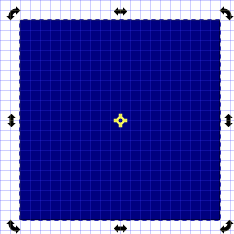
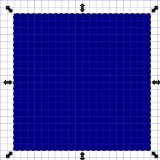
From the toolbar at the top, choose the third icon in the cluster shown in order to move the rectangle down and behind the heart. (Hover over each of the choices in that group and think through to be sure you understand how each one works. Go ahead and experiment, but wind up with the rectangle under the heart.)
I was not content to stop there. As I write these notes, I realize that I crammed a whole bunch of steps into the video. Sorry if these notes seem much longer. It is easier to rattle on in a live session than it is to get all the details into written form.
Doing some similar shape work, lets make the image a little jazzier.
- Select the heart with the main selection tool.
- Hold down the Control key and tap the D key (Ctrl+D) in order to duplicate the heart. You could also use the Edit menu to duplicate.
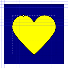
- Now make it yellow.
- With the yellow heart selected, access the Path menu and choose "Dynamic Offset"
A single little handle will appear at the top of one lobe of the heart. We drag that up to create an offset. The exact amount does not matter, but keep it fairly small if you can.
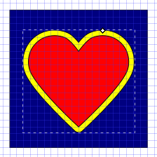
Repeat the earlier steps to lower the yellow heart below the red one. If you go too far, just bring it back up with the appropriate toolbar button or resort to the faithful (Ctrl+Z) keyboard trick to undo. Just don't rush that or you'll back up too many steps in the tutorial and need to re-do them.
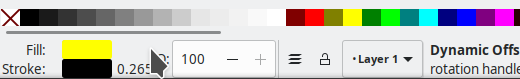
The next section is about dealing with color in a more complex way than simply choosing it for an object/path. Most of the time I use the lower left color toolbar to do basic color choices. With any object selected, you can click the color of your choice to change the fill. To change the stroke color, hold down the shift key while clicking the color of your choice.
To erase a color, for example, right click the corresponding color swatch in the very corner and choose Remove Fill.
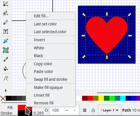
If, instead, you want to edit the color, choose Edit fill from the top of that popup menu. A fancy dialog box will open (typically to the right side of the window.
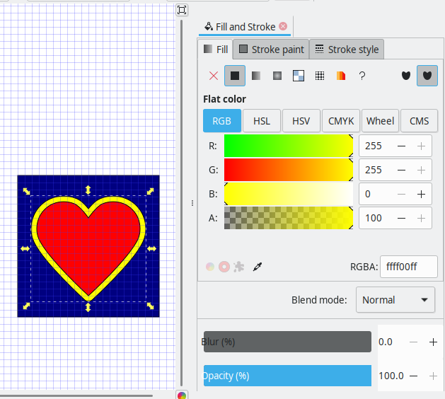
The fancy fill/stroke control menu has three tabs. We will only look at the first "Fill" tab outlined in blue in the following image. The current fill is a solid color (shown as the icon outlined in green).
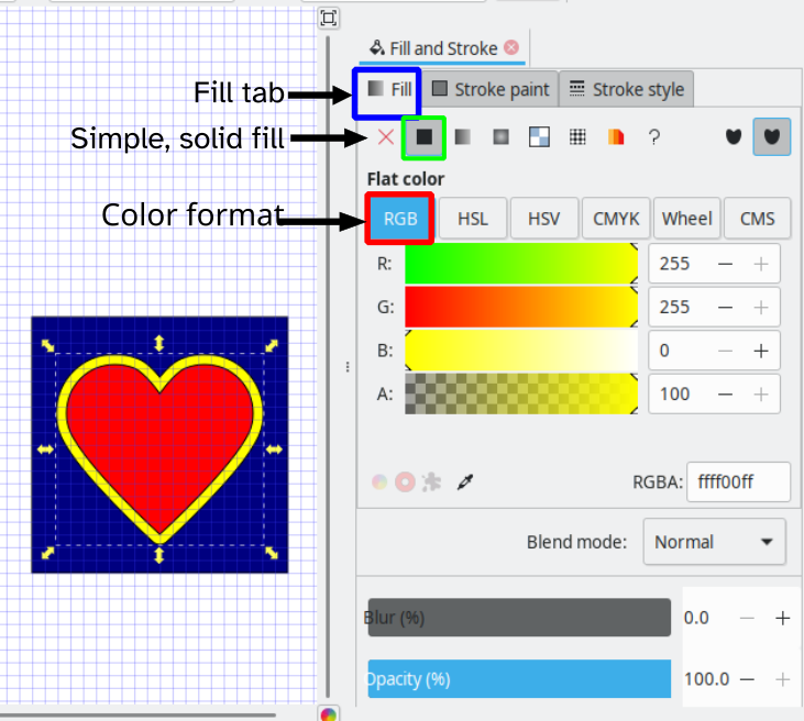
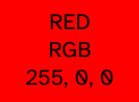
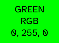
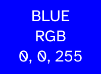
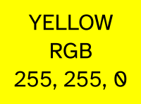
The type of color control is known as RGB which stands for the mix of Red, Green and Blue primary colors used frequently for the World Wide Web and elsewhere. It turns out that bright yellow is a combination of maximum amounts of red and green. 255 is the decimal value assigned to mean "maximum" value of the given color. You should be able to see that a bright yellow has zero blue mixed in. Yellow can be described as 255,255,0 for RGB. By contrast bright red would be 255, 0, 0 and bright blue would be 0, 0, 255. I think next time, I'll spend the time exploring this menu in more detail.
The last bit covered in the video is text put on top of the heart image. In these notes I'm going to simplify a bit, glossing over the fancy font I used for the video. For your practice, choose any font you already have on your system. A future presentation can focus on fonts in Inkscape, finding, installing and using them.
Let's select sans-serif as the font because it will use your computer system's assigned simple-shaped font. The technique will work no matter what that font specifically is. Choose the text tool from the left side toolbar. Type or select sans-serif in the first text box of the top toolbar; change to bold and work with a font size that will fit into the heart. For me, that was the standard 18 point font size.
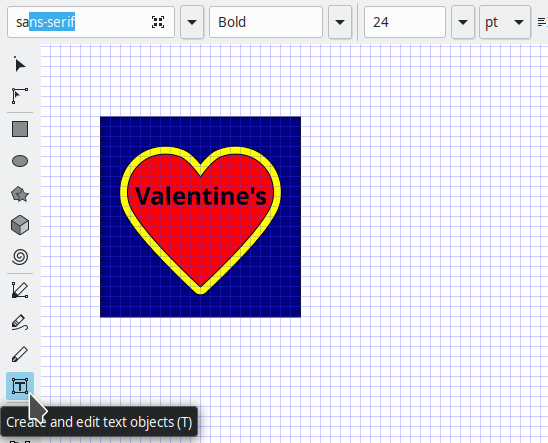
For the second word, enter it as a separate word and make the text larger and bold. I chose 24 point.
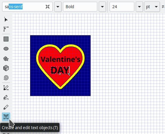
Finally, double click each of the text entries in turn to get the rotation controls and use a corner handle to rotate a little bit left.
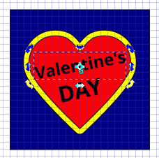
Before doing the second word, duplicate "Valentine's" and make it yellow. Using the arrow keys on your keyboard, nudge the position of the yellow text up one or two arrow taps. Do the same nudge to the left in order to achieve a two-layered text effect, something like a sharp-edged drop shadow. Repeat the nudge for a yellow version of the word "DAY".

Please feel free to contact me with questions or to request changes to this page for things I messed up. "Everything is a Work in Progress."