Home > Responsive Design - Comparing menus
Responsive Menus
Comparing Two Menu Styles
I am trying to decide which "responsive" menu works better for visitors using mobile devices and would appreciate your help.
Please compare the vertical (portrait) mobile menu of ul.html with the vertical (portrait) menu on the details.html page.
Neither is perfect. I am still working on them.
Let me know which you prefer.
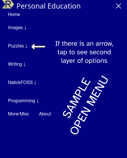
Most responsive menus use <ul> elements and are single layered. I've worked up a two-layer menu which uses <details> elements.
Single Layer Menu
Clicking Puzzles link goes to
second page before
choosing the kind of puzzle.

This is the UL-style menu
It is one layer.
Clicking Puzzles link goes to
second page before
choosing the kind of puzzle.

This is the UL-style menu
It is one layer.
Two-layer Menu
Clicking Puzzles link expands
to show the three kinds
letting you choose the kind of puzzle.

This is the DETAILS-style menu
It is two layers.
Clicking Puzzles link expands
to show the three kinds
letting you choose the kind of puzzle.

This is the DETAILS-style menu
It is two layers.