 Personal Education
Home > Responsive Design UL Menu
<ul> Single Layer Menu
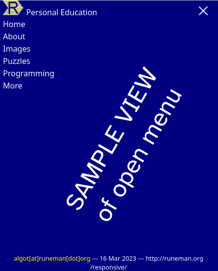
This page is for testing "mobile first" menu preferences. Clicking/tapping the "hamburger menu should reveal a menu with clickable choices. Each will lead to an existing "old style" page, so come back here to get the feel for the menu.
Note: The hamburger menu only appears on vertical (portrait) displays or browser windows narrower than 768 pixels. Please test on a mobile phone or tablet. Thanks.
The menu links are "live" and go to real "old style" pages which have not been converted to responsive design as yet.