 Personal Education
Home > Responsive Design DETAILS Menu
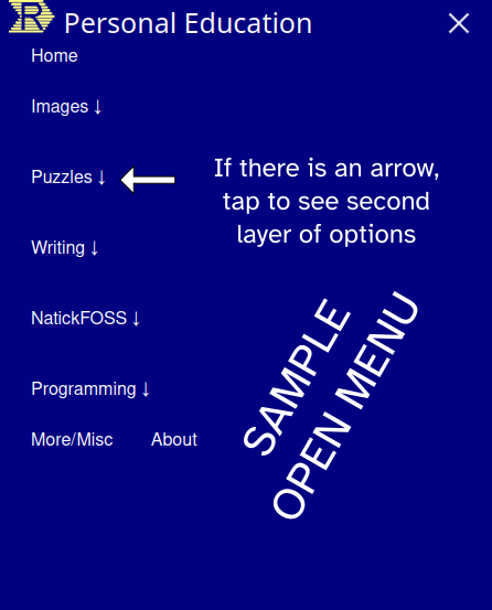
<details> Two Layer Menu
This page is for testing "mobile first" menu preferences. Clicking/tapping the "hamburger menu should reveal a menu with clickable choices. Plain options will lead to an existing "old style" page, so come back here to get the feel for the menu. If an option has an arrow pointing down, it can be expanded to show the second "layer".
Note: The hamburger menu only appears on vertical (portrait) displays or browser windows narrower than 768 pixels. Please test on a mobile phone or tablet. Thanks.
The menu links are "live" and go to real "old style" pages which have not been converted to responsive design as yet.