Comparing values is usually done with some sort of column/bar chart. The visual emphasis is showing size difference side-by-side.
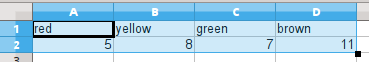
For this example, I'm going to compare the count of some objects with different colors. If you are a fan of M&M's® chocolate candies, like me, you can work along with this activity. Substitute Skittles® if chocolate isn't your thing, and if candy is out of the question, maybe you can haul out a pile of your child's or grandchild's Lego® blocks. If none of those options work for you, pick your own colors and make up the numbers.
Note to the lawyers:
Now that I've followed the rules, showing the symbol ® by the names to recognize their status as trademarks, I'll just slide along without the marks as we move ahead.
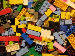
Lego image by Benjamin Esham (CC-BY-SA)
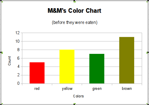
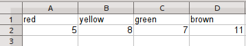
After opening my small (restraint!) bag of M&M's onto a clean tray, I arranged them into groups by color and counted each color. Here are the results that I got. I entered the numbers into the second row of a new Calc spreadsheet. By adding the colors in the first row, I get automatic labels for my chart.
The data isn't very complicated, but keeping it simple may help us to focus on the chart making process.
Next, select the cells, A1 through D2, to be included in the chart and go to the menus to Insert -> Object -> Chart.
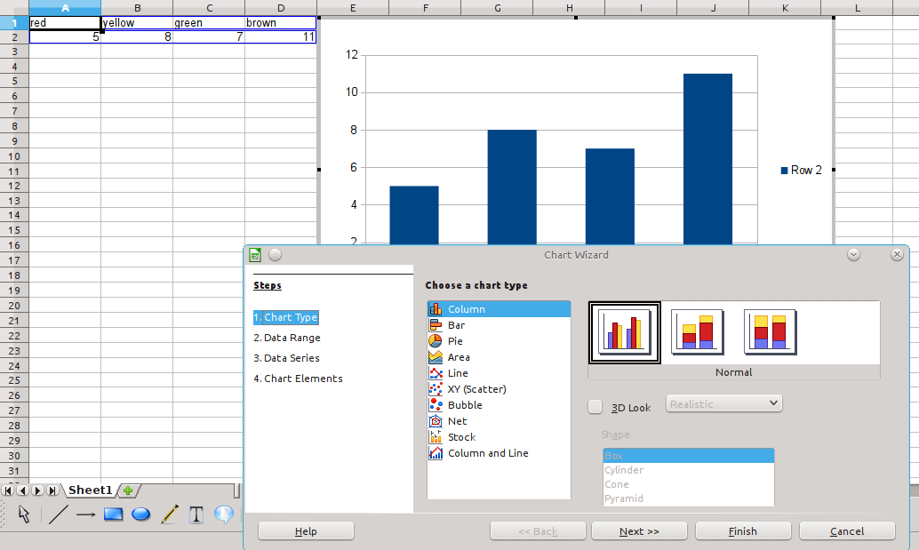
Click the image to see it full size, and click your browser's "back" button to return.
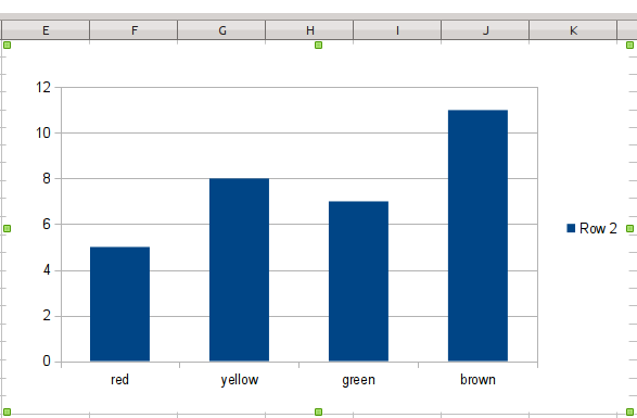
For now, click the "Finish" button and you will get a four column chart with the color labels below each bar. But the bars are all the same color. Boring! Let's fiddle with the chart to make it more colorful. Let's match the bar color to the name.
 Note:
Note:
This next section of steps can be tricky. LibreOffice Calc will let us change the colors, but the editing of individual bars depends on the appearance of the chart.
Look closely with me. Right after you click the "Finish" button, the outline of the chart is a solid gray with handles in the corners. To edit the chart object it needs to show the gray border.

If the outline disappears, you can get it back by double-clicking the left mouse button on any part of the chart.
When the border is plain, but with handles at the edges and corners, you can click and drag the whole chart around on the spreadsheet.
When the border is plain without handles, it is "normal" and shows how it will look if you print the sheet.
Explore. Please take time to click on a cell (which will un-select the chart) and then click or double click on the chart to see all the border states. Try moving the chart around. When you are finished with seeing how the chart state varies, double click somewhere on the chart to get the chart back to having a gray border, the editable state.
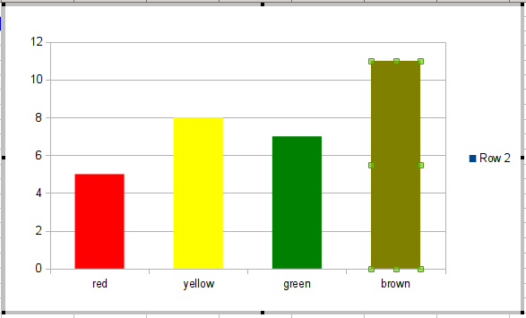
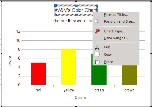
Next, we're going to focus in on the bars within the chart. Click any of the bars. I clicked the one labeled "red" because I plan to change that color first. A handle (small square) will appear in the center of each of the bars on the chart as shown next.

Click the bar above the label "red" again to focus in on just that bar. Handles will appear on that bar alone.
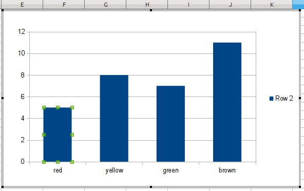
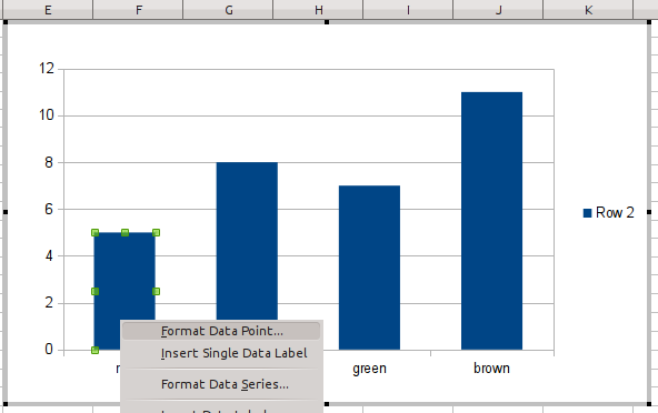
Now, right click on the bar above the "red" label, and the bar's context menu will appear. We're going to select "Format Data Point..." from the context menu.
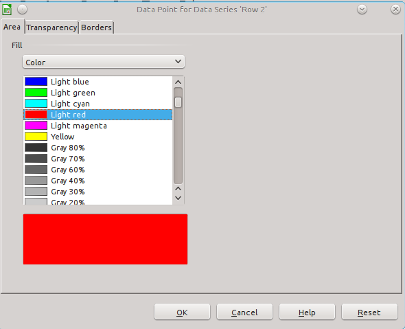
A dialog pops up to show the color options for the bar. It will be showing the current default color selection for "Chart 1." Look for the slider control for horizontal scrolling and slide it up to the top...and then a little bit back down so you see the "red" and "light red" color choices. I've selected "light red" because it looks brighter to me.
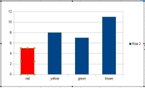
Now repeat selecting individual bars and changing their colors. My result looks like the next image.
Now let's go back and add labels. We may know, today, what the chart represents, but if we decide to embed it into a word processing document, it will look better and make more sense with clear labels. Let's work toward something like this next image.
Back in the beginning of making this chart, we clicked the Finish button before some of the default steps of chart making. I wanted us to concentrate on the making of bars and getting them just the way we wanted them. We could have done some labelling steps as we were first creating the chart. The chart can be edited "after the fact", though, as we are doing. I like to add my labels at the end because I've thought through the chart for a while and have a better idea about what I want the labels to be. (If you decide to do all the chart setup steps at once, you can still edit them later, of course, just as we're doing here.)
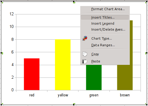
The first step is to add a title. Click the chart to select it. Then double click to get the gray outline which tells you that you can edit the chart. Right click above the bars. From the context menu, choose "Insert Titles..." from the menu.
A dialog opens with spaces to type in many labels. You may enter the elements as you see fit, or you may copy what I typed.
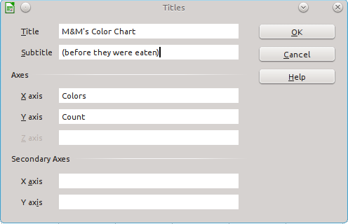
When you finish, click the "OK" button. LibreOffice Calc automatically positions the chart title at the top, the subtitle just below it, and the axis labels at the left (for the y axis, which goes vertically) and the bottom (for the x axis, which goes horizontally).
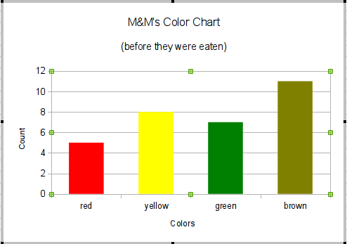
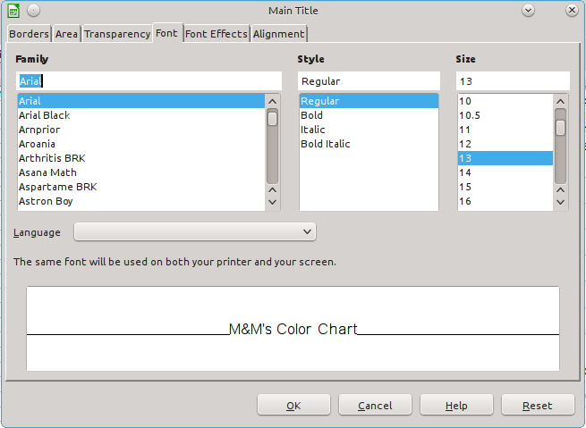
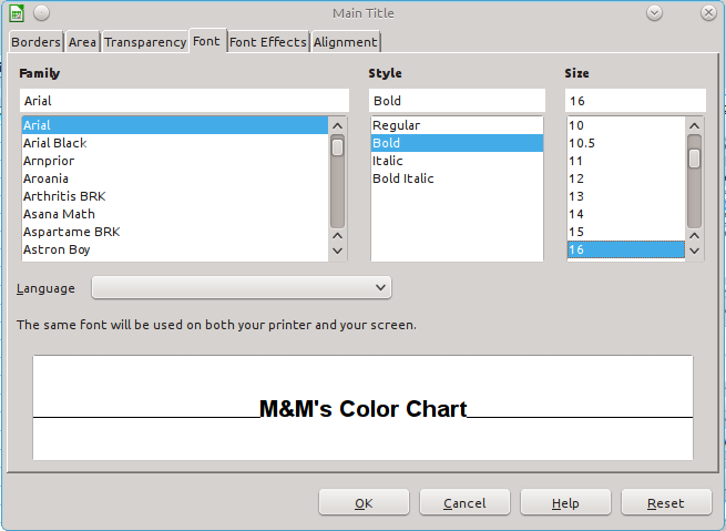
I'm almost satisfied, but I think I want the title to be more impressive. Let's take another editing step and make the letters bigger and also bold. Right click the title at the top of the chart. It will get handles and you'll also see the context menu with the "Format Title..." option at the top. Choose it.
The next two images show the settings that were the default for the font (make sure you are on the font tab...there are other options to play with, too). You'll also get a preview of what you choose for font features.
Maybe that's enough for this section of the guide. As usual, I strongly recommend that you repeat the set of steps with different numbers, Maybe try adding data from more than one bag of candy and put the data for each bag into its own row. See what you get for a chart with that (you can make up the numbers if you want. There is no point in forcing you to eat bag after bag of candy!)
Up next, Pie Charts - displaying relative amounts of each component of one thing, "Parts of a Whole."
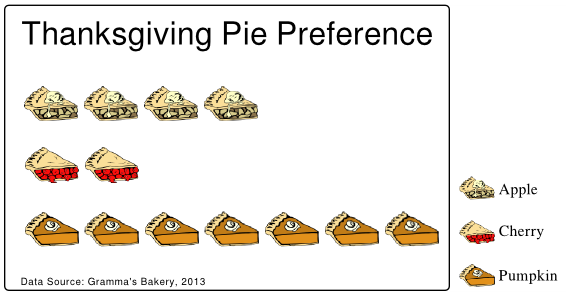
Wait, wait, wait! That's not a pie chart in the sense that we mean for this guide. That image is really a special sort of bar chart, one called a pictogram. Pictograms add images to the bar graph concept to drive home the subject of the comparison. Titles and legend labels are almost unneccessary. A spreadsheet like Calc is not the app for generating pictograms. The one shown here was done using Inkscape, a popular and effective Free Software (open source) illustration program. The individual pie slice images were found at the openclipart.org website. A contributor identified as "Gerald_G" created the images of pie and donated them with a public domain dedication. Clipart from openclipart is free to use with no restrictions. Enjoy. (SVG Inkscape Pictogram File)
© 2013- Algot Runeman - Shared using the Creative Commons Attribution license.
Source to cite: - filedate: