When you need to express percentages in a graph, then it is the pie chart that best does the job. You could also talk in terms of fractions instead of percentages. Either way, you are looking at the parts of some whole thing and comparing how the parts fit into the thing. Pie charts are often used to show the way the national budget is spent. Those numbers are too big and scary for me, though. Let's look at smaller numbers here, OK?
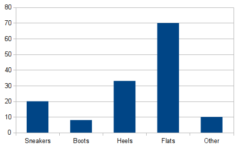
Actually, in some situations a graph isn't worth much. Sometimes there are too few parts or the split is boringly obvious. The more components that are part of the whole, the more useful the chart may be. Of course, too many components can lead to a cluttered and confusing graph. Check out the following five scenarios, each with a basic pie chart.


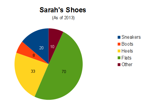
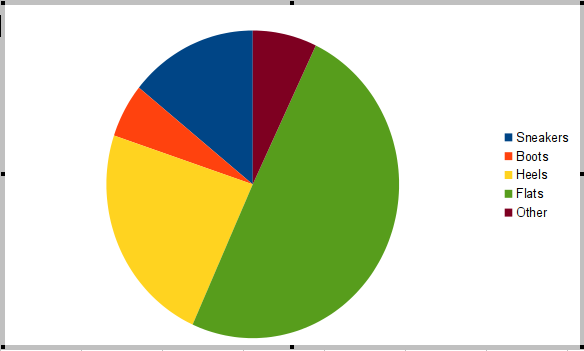
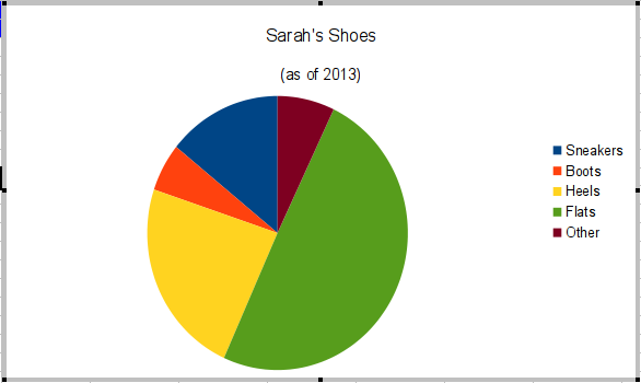
You might notice that the color segments move counterclockwise around the circle beginning at top-dead-center with the dark blue. Calc automatically assigns the colors, which you can change if you wish in later editing.
Let's go on to the details next. We'll walk through the steps, adding labels to the chart as well.
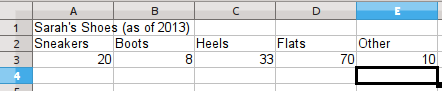
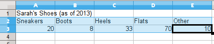
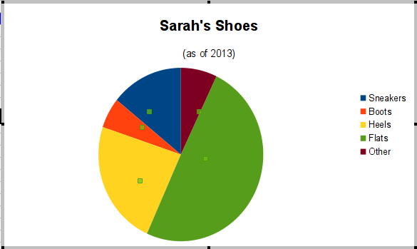
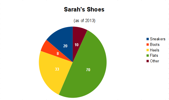
For data, we'll look at all of the shoes that Sarah has in her closet as of 2013. We'll create a spreadsheet of the main kinds of shoes we see (assuming Sarah will let us rummage through her closet). The data looks like the next illustration when you type it into a LibreOffice Calc sheet. Please note, to reduce graph clutter, we lumped several unspecified types of shoes into an "other" category. I decided to focus on the top four types of shoes in Sarah's closet.
For the record:
Sarah is an imagined person. She might only have a single pair of combat boots which she never removes, even to sleep! I have never visited her closet.
Why Pie?
Now, I'm sure some of you are saying that this data could be a bar graph or "column chart" as it is called in LibreOffice Calc, You might win an argument with some people, but understand that I'm interested in how Sarah's whole shoe collection fits together. So I won't be satisfied with the bar/column version of the graph. I will be much happier if I can illustrate Sarah's shoe data with the pie chart, instead.
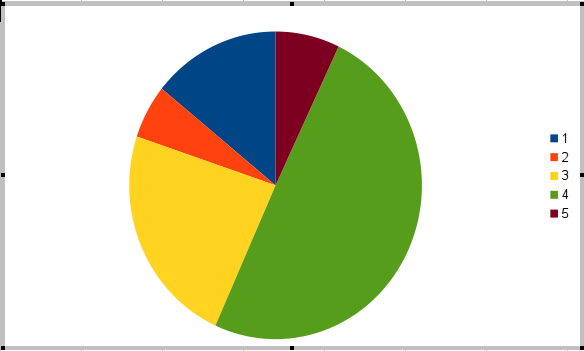
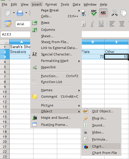
Start by selecting the data rows. If you select just the numbers, then the legend you get will be very sparse, just the item numbers of the dataset.
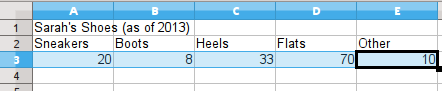
You should, therefore, click and drag to select both the row of labels and the numbers. Then the legend will make more sense. Calc automatically puts the legend in place at the right.
After you select the data, use the "Insert" menu and choose the "Object" option and finally the "Chart" sub-option.
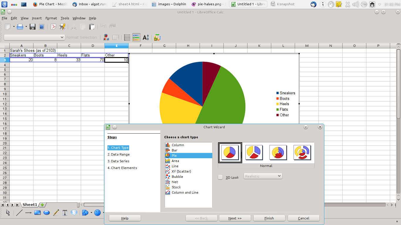
There is a sequence of standard steps in a "Chart Wizard" dialog popup window. To conserve space on the web page, I have put reduced-size images in place, especially when they are full screenshots. To see more detail, please click each small image to expand to a big version as you work through each step in the Chart Wizard. Then use the browser's back button to continue reading.
The first step is choosing the chart type. The default is the Column graph, so click on "Pie" down the list. Stick with the "normal" version which has the simple divided circle form. The other versions are something to examine in more advanced tutorials or to explore on your own, always good practice.
(Click to enlarge)
In other charting sections of the guide, we have often clicked "Finish" after the first step, but this time, we will go through all of the steps to look more closely at the options offered by the Chart Wizard in Calc.
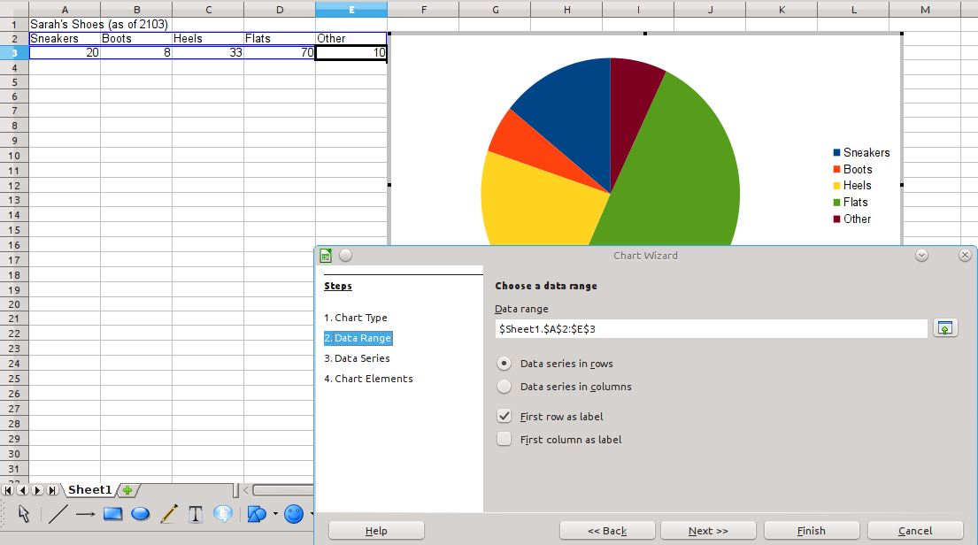
You selected the data range by dragging your mouse around cells A2 through E3. As you look at the next image, remember you can click it to enlarge it or you will need to squint to see that simple selection of the range. In the dialog, you see $Sheet1.$A$2:$E$3 which is how the "absolute reference" range is done. Without the dollar signs, a data range is considered a "relative reference."
Aside:
Please just accept those terms for now. Absolute references are a bit more advanced than this guide generally discusses. Another section of the guide may cover them at some point, or you can look up the concept in the LibreOffice Calc manual on your own.
For ordinary graph work, it is easiest to specify the range by dragging to select the cells, but here, in the data range option of the wizard, you CAN make advanced adjustments by hand if you know what you are doing. For now, I would recommend that you don't change anything in that range specification. Consider experimenting later on your own, though. The Chart Wizard also shows you that the data series is in rows (because that's the way we entered the data in the sheet. Finally, you see that Calc has recognized that the words in row 2 are the labels for the dataset. Neither of these options need to be changed at this time.
(Click to enlarge)
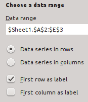
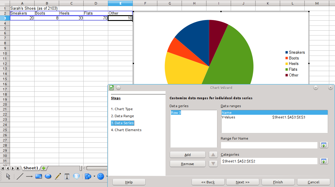
Note that the data series is identified as Row 3. That's enough information for our needs. Once again, the step is designed for making more advanced, manual adjustments. In our situation, those adjustments are not needed.
(Click to enlarge)
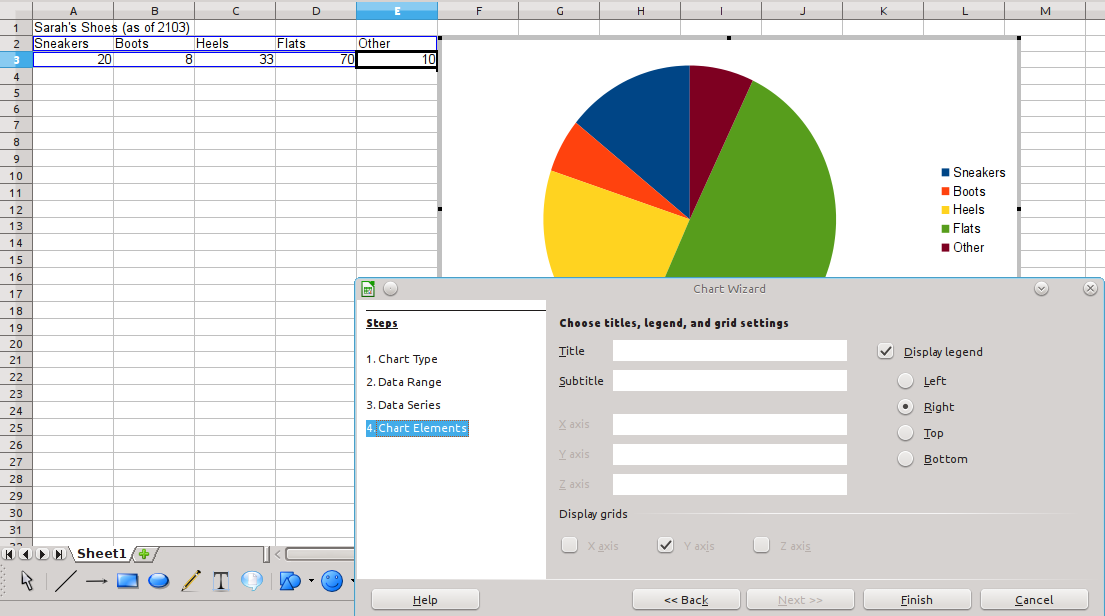
Finally, we have a fourth step where we can do something to adjust the appearance of the chart. Here we add a title, and the optional subtitle. Back in the guide section for Bar graphs, we added these elements in manually without the wizard, but it may be more comfortable to you to use the chart wizard to make sure you remember to add them. The default location for the legend is to the right of the graph circle, but you can see that the choice is yours. You could even decide to un-check the option to not display the legend if you wanted.
(Click to enlarge)
Although the chart is now "complete", I would like to enhance the chart's appearance. Fortunately we can manually edit a chart and its individual elements. We are on our own, here. There is no wizard to guide our steps. Please understand that I'm pushing beyond the basics here in the third exploration of charts so you can expand your skills if you want to do so. If the basic chart serves your needs, stop. However, keep in mind that you can go on to other things and refer back when you are ready for more chart editing.
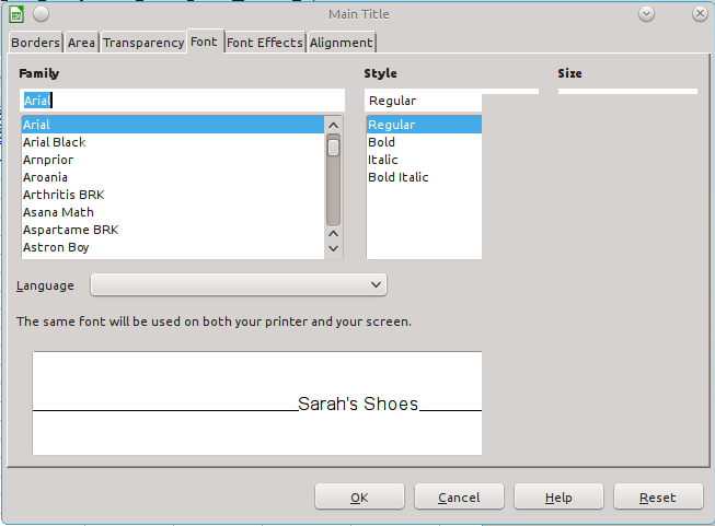
Making the title larger
The first extra step to explore is making the title bigger. As it is, the title does not stand out from the other chart text. I think it should. First, click the chart to give it the "selected" handles. Then double click to give the chart the "edit" handles with the gray outline. You will remember we did these steps when looking at the bar charts. Go back to look there if it has been a while since you worked with that section of the guide.
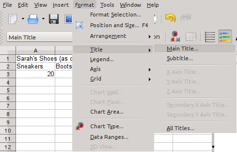
With the chart in edit status (or "mode"), the Format menu choices are focused specifically on the chart. Click to open the "Format" menu and go to the "Title" option and "Main Title" sub-option. (You will not see these menu options if your chart isn't in edit mode.)
 Note:
Note:
Just a reminder that the default Calc font on your system may be different. It may not be Arial as it is in these examples.
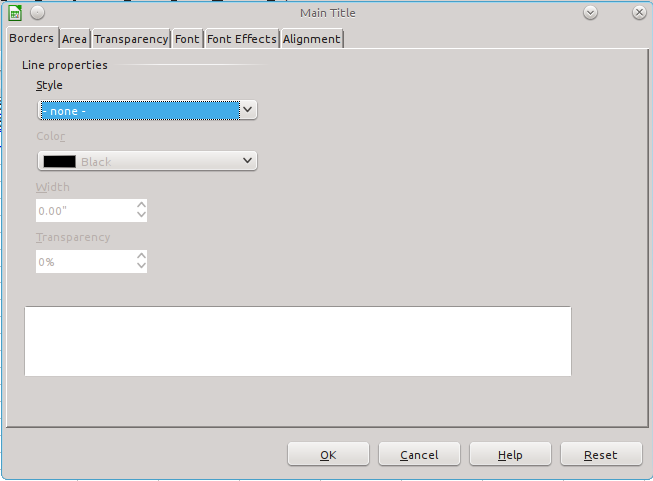
The dialog for the title is extensive, with several tabs of options. Initially, the first "Border" tab will be visible. In this exercise, we're only going to change the font characteristics, so click on the "Font" tab. Once there, try modifying the title to use Bold and a bigger text size. I chose 16 point size. Certainly, explore further. Look at other tabs and experiment.
(You can enlarge each image with a click)
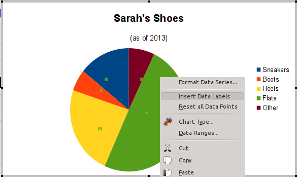
Adding Numbers to Pie Segments
The next step is even more advanced, and some might argue that the pie chart does not need to show what the data point numbers are. After all, we are showing how the percentages break down. Skip this if it seems wasted effort or beyond your needs.
The chart should still be in its editable state (gray border and handles). Click the circle of pie segments. Handles should appear in the approximate center of each segment. Right click somewhere on the circle and a context menu will offer you options. Select the "Insert Data Labels" option. The numbers will appear for each segment.
(Click to enlarge)
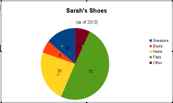
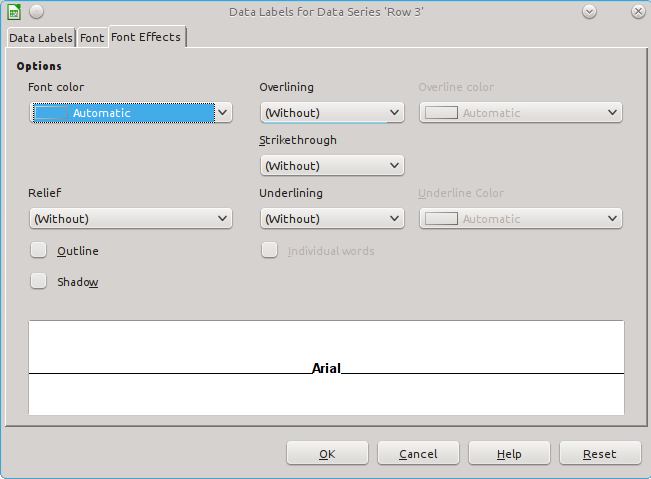
Modifying Color for Contrast
To my eyes, the thin text of the black numbers has too little contrast with the colors of the pie chart segments. Right click the circle again and pick "Format data labels." Then select the "Font Effects" tab in the dialog. I chose to make the digits bold and the text white in the dialog. ("Automatic", the default color, is usually black.)
(Click to enlarge)
One final note:
It can be argued that the numbers shown in the dataset should not be raw counts, but percentages, instead. To accomplish that, do a conversion of the data into percentages in your spreadsheet before creating the pie chart. When you add the dataset values to the chart, they will show percentages.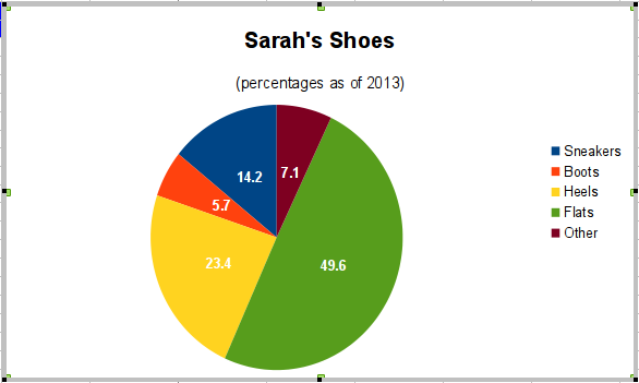
© 2013 Algot Runeman email- Shared using the Creative Commons Attribution license.
Source to cite: - filedate: