A good graph helps to make sense of numerical data. Graphs or "charts" as they are called in Calc give us a quick look at the pattern of numbers. Humans are very visual. We depend on our eyes for a lot. Graphs/charts capitalize on our visual nature. Please be patient with me if I mix the use of the terms chart and graph. Spreadsheet program designers like "chart" but my school training called these things "graphs."
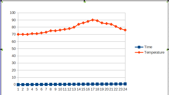
The image quickly tells us that the 24-hour temperature rose steadily from midnight and then fell as the day headed to the next midnight.
If I asked you, "Was it warmer in the morning or the afternoon?" you wouldn't even need to glance at the temperature scale on the left edge of the image. Your eyes would track the line and you would quickly decide an answer. Of course, looking at the scales isn't cheating. The scales help, so it is good that they are there. Calc automatically converts the numbers of a spreadsheet into this chart in just a couple of steps, including the scales if we include their data. (You may prefer to call a scale by its math name "axis.")
Start Calc and follow along. Doing the steps yourself is very helpful, making concepts stick better. Reading, all by itself, isn't as good as exploring. The more pathways you use to develop your understanding, the more rich the set of connections will be. More connections to what you already know improves your ability to remember.
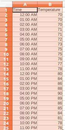
Enter a set of labels and numbers like the ones shown in the following image. You do not need to use the same exact numbers. And if you just enter the times as 0 through 24, that is fine. (I'll explain how to do time series later).
Put the labels "Time" and "Temperature" at the top to identify the columns so we can get Calc to use them when making the chart.
We are going to make a line graph this time because line graphs are the standard for time series data.
Save your file so you can explore and go back to the original later. Saving a clean original version is generally wise. As you move through your explorations, use "Save As..." to give yourself reference versions so you can track the steps you took.
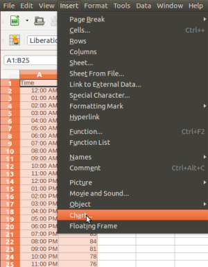
When you have created your data in two columns, click in cell A1 and drag your mouse down to cell B25 and release the mouse button. Try again if the highlight doesn't cover the full set of data. You are selecting the data range for the graph. Calc needs to know which cells the chart will use. This step defines those cells.
 Note:
Note:
If something odd happens, remember Ctrl+Z will undo the last thing you did, putting things back the way they were.
Next, slide your pointer up into the title bar at the top of the window. The Calc menus will appear. Click on "Insert" and choose "Chart" as the next image illustrates.
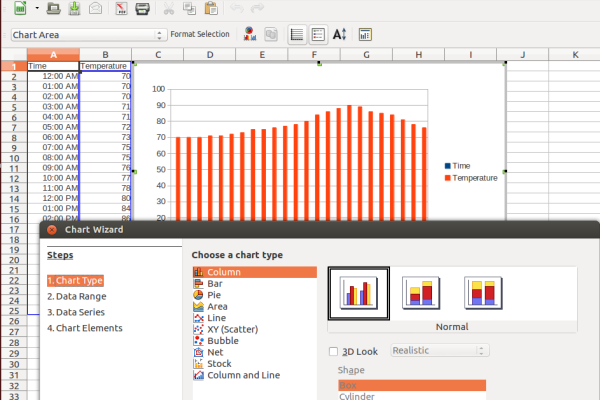
As soon as you click, a chart will appear. It will be a column (bar) chart. A bar chart, whether it is vertical or horizontal, isn't the right kind of graph for this data. A column/bar chart compares two or more things and we'll explore that kind after the temperature chart/graph.
For a series of temperatures measured over time, we need a line chart, so look down the list of choices and find the line charts. We're almost there. We also want the dots connected, so choose the second type.
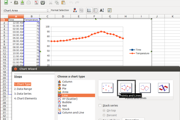
For now, let's be satisfied. There are other steps you can do with the wizard to refine the chart, but the basic chart is all we need this time around. Click "Finish."
 Looking Ahead:
There are so many options available when using the chart wizard that it seems sensible to try to concentrate on the basics at first. Once you have a good grasp of making a few sample charts, then you can take time to add more and more to your explorations. The whole guide is intended to be relatively basic. Your own experience and the needs you identify while you work will lead you to ask questions and to search online resources for answers. The next two sections will go through bar/column charts and pie charts. Line, bar and pie charts cover most routine needs for graphing data. If your particular data needs the visual support of other graph types, ask somebody for help.
You can click on the box containing the whole chart image and drag the line graph around to make it fit the page just the way you want. Even more, you can also right click the chart image and choose copy from the context menu. Then you can put the graph into a word processing document, pasting it there from the clipboard. The ability to copy both images and text between computer tools is one of the most powerful things about a computer. You can compose complex documents from many sources. With practice, you can be very professional.
Note:
An advanced sort of "copy and paste" is called "Object Linking and Embedding (OLE)" which allows you to create links between two files (word processing document and spreadsheet, for example). If the numbers of the spreadsheet change, the chart will change and the next time you print the word processing document, the updated image will appear, not the old version. This technique is great for use in monthly reports where there is a regular need for charts based on new numbers.
Up Next:
The next couple of sections will examine column/bar graphs and pie graphs. Stay tuned.
© 2013 Algot Runeman - Shared using the Creative Commons Attribution license.
Source to cite: - filedate: